Creating Consistent Status and Metadata Patterns

Standardized badges and tags to make design faster, clearer, and consistent.

JSTOR + Artstor
Role: Product Designer / Design Technologist
Team: Cross-functional (design, PM, engineering)
Company: Delta Dental of California

Designers across the organization were creating their own solutions for representing status, metadata, and applied filters, leading to inconsistent patterns and misalignment across products. I investigated this problem and designed standardized components to help teams communicate more clearly while maintaining flexibility.

Context & Challenge

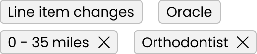
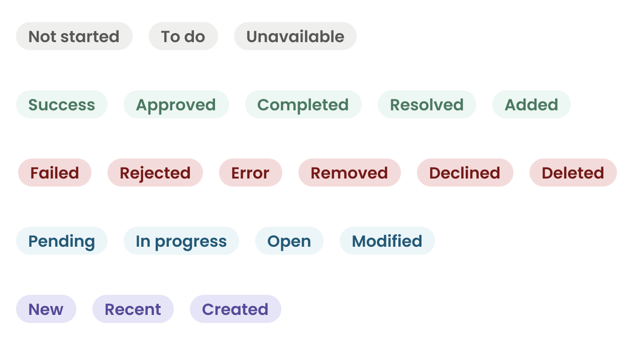
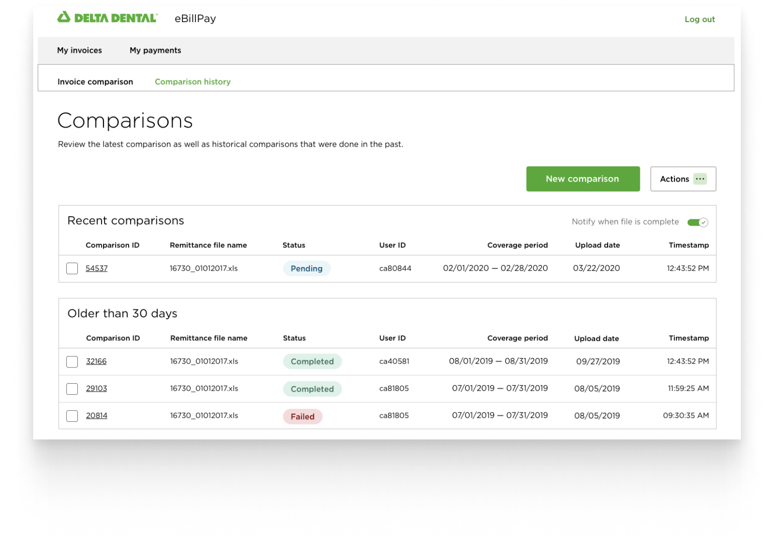
  • Lack of a standardized Badge or Tag component caused confusion and misalignment.
  • Designers had to invent their own solutions for similar use cases, slowing down design and dev.
  • The main tension: defining what job each component was “hired” to do and creating Badge categories that were logical and adoptable.
  • Constraints included organizational alignment, accessibility needs, and scaling across multiple product areas.

My Role

I led the investigation, defined the conceptual framework, and created the design solutions. I also documented guidelines and mentored other designers to use the components consistently. I partnered with PM and engineers to ensure the components could be implemented flexibly but predictably.

Research & Insights

  • Gathered designer feedback on recurring needs and frustrations.
  • Interviewed product teams to understand how they were using informal patterns.
  • Observed usage of existing components and patterns, noting pain points.
  • Evaluating other design systems and how they were solving similar problems.

Key Findings

The real problem was conceptual, not visual: designers needed a mental model for who “owns” information and how to apply it consistently, not another visual treatment.

Design Goals

  • Clarify the difference between system-driven info (Badges) and user-applied organization (Tags).
  • Maintain flexibility without sacrificing consistency.
  • Ensure accessibility and clarity for all users.
  • Reduce cognitive load for designers and engineers using the system.

Ideation & Concept Development

To tackle this design challenge, I did several things:

  • Framed components around jobs-to-be-done rather than appearance.
  • Defined:
    • Badges: communicate system-owned info (status, state, warning).
    • Tags: communicate user intent (applied filters, categories).
  • Explored Badge categories by type of info, user behavior, and accessibility considerations.
  • Created early sketches and example UI for discussion with designers and PMs.
Image showing clarified hierarchy after redesign

Solution

  • Introduced standardized Badge and Tag components with clear JTBD framing.
  • Provided a small, understandable set of Badge categories that scaled.
  • Created plain-language documentation with “do / don&t” examples to guide designers.
  • Focused on practical adoption rather than exhaustive rules.

Badge

A visual text label that provides a status for an item. Uses color, content, and an optional icon to convey meaning.

Badge example

Tag

  • Used to add clarifying information as metadata to an object
  • Used as removable filters applied to a search
Tags example

Outcomes & Impact

  • Designers quickly adopted the components, reducing redundant pattern creation.
  • Increased alignment and faster decision-making across the platform.
  • Documentation reduced support questions and onboarding friction.
  • The mental model (system vs user) became a touchstone for other design discussions.