Design Systems insights
A case study on adding new components
Overview
A growing need from designers for a "tag" component revealed a need for two distinct components.
Role
Product Designer
User Research, Interaction, Visual design, Prototyping & Testing
Context
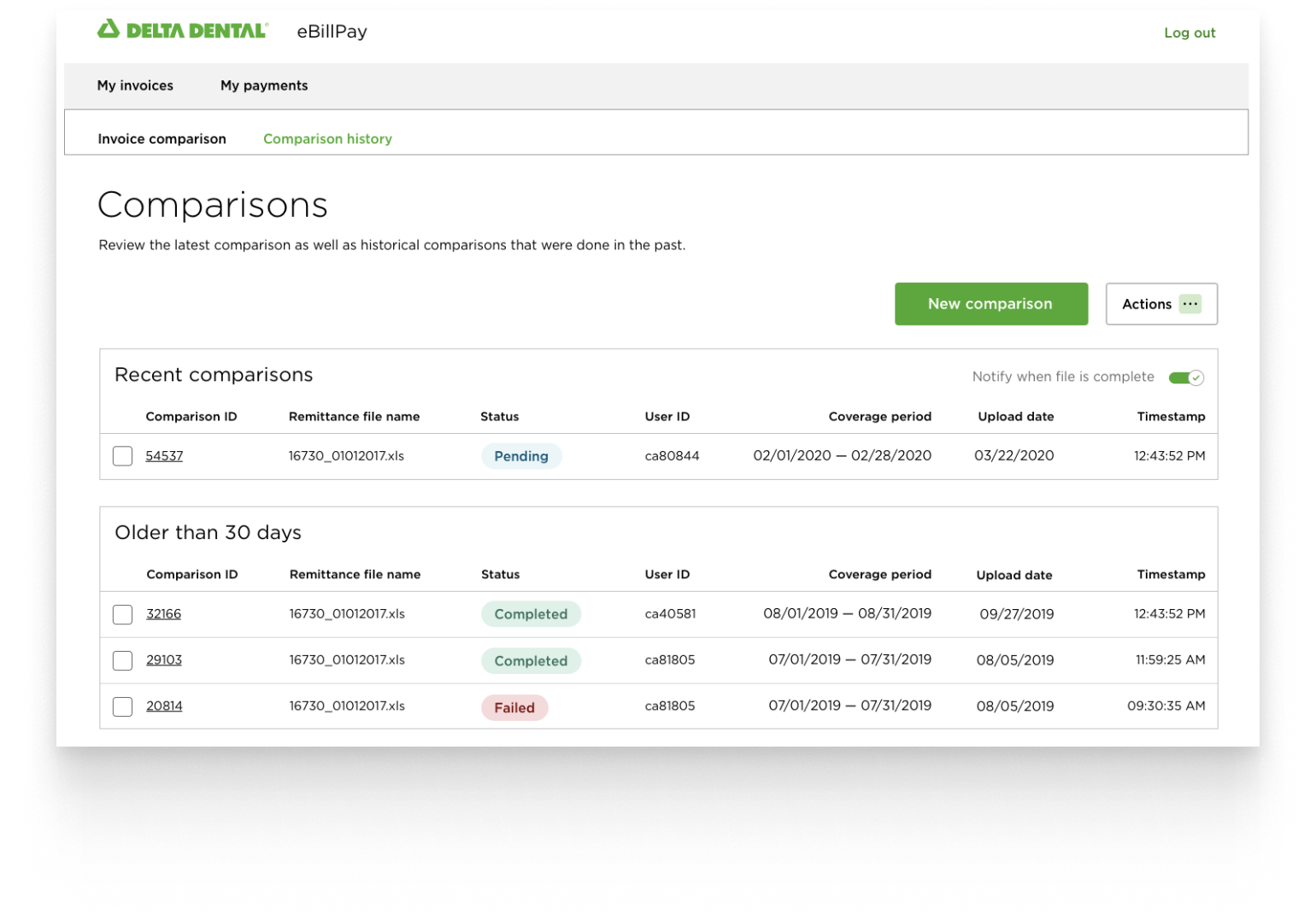
- Emerald, the design system at Delta Dental of California, is still fairly new.
- Our team is small, but scrappy: 1 designer 👋, visual designer, 2x developers, accessibility advocate, manager, Emerald Champions.
- Several requests from designers for a “tag” component
Objective
Understand use cases, the job we're hiring this component to do, and chart a path foward through the design system.
Research
- Met with the designers to go through workflows, the problem we are trying to solve and value we are trying to provide for users.
- Investigate ~20 different design systems for components solving similar problems, documentation, usage, etc.
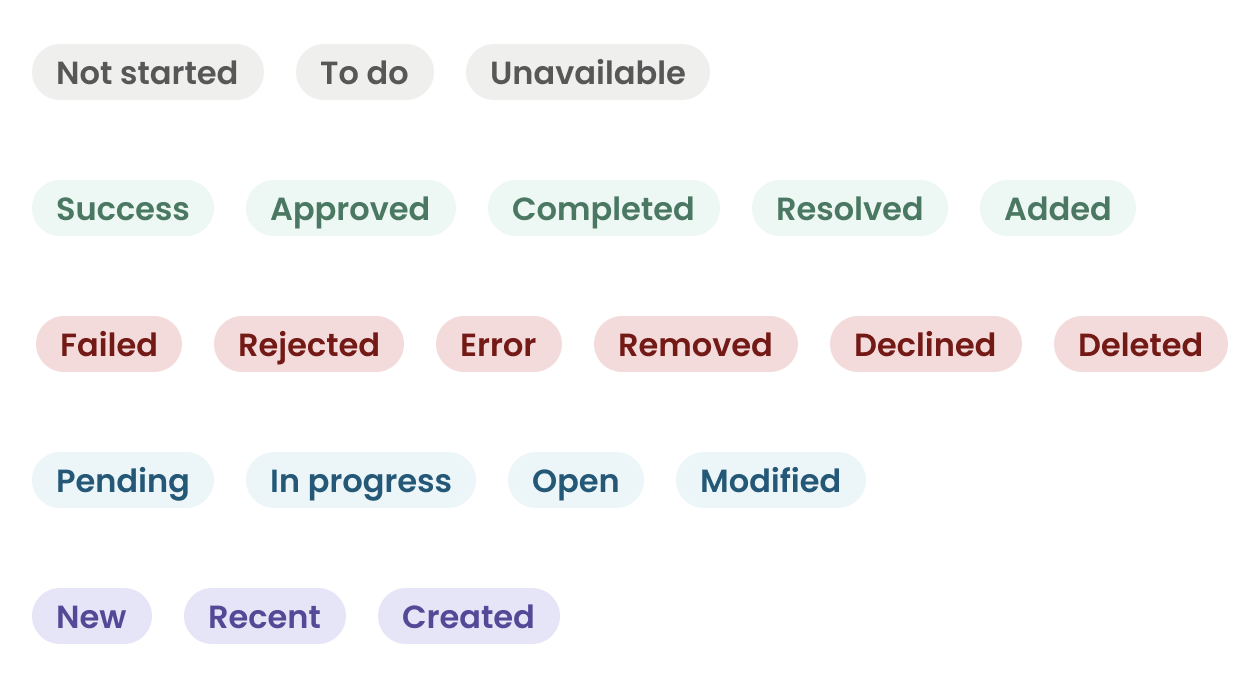
Findings
Through research, we uncovered three distinct use cases:
Show the status for something like a claim or report being generated.
E.g., Accepted, Rejected, In Progress
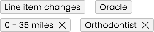
Metadata added to an object to categorize that object.
E.g., HMO, PPO, Line-item change
A way to represent filters applied to a search.
E.g., 0 - 15 miles, Open Saturday, Endodontist
Constraints
- Don't make it too button-y
- Don't rely on color alone to convey meaning
- Consider point of view and hierarchy in the system
- There is at least one team not leveraging React
Solution
To meet the different use cases identified, we decided we needed two separate components:
Badge
A visual text label that provides a status for an item. Uses color, content, and an optional icon to convey meaning.

Tag
- Used to add clarifying information as metadata to an object
- Used as removable filters applied to a search
Hierarchy
We wanted Badges to fall below primary CTAs, but above regular text: